B2B Dashboard Design: Best Practices From Real Practice
Good B2B dashboard design starts by deciding what one question the screen answers, then ranking every metric, chart, and control against that question — density is earned through hierarchy, not crammed in. A B2B dashboard is a working tool people open many times a day, so the bar is different from a marketing chart: it has to be fast, honest about its data, and legible under real conditions.
I have designed dashboards for analytics products, workplace tools, and internal ops consoles, and the same mistakes show up every time — too many KPIs with equal weight, charts that look impressive but answer nothing, and states nobody designed because the demo data was always full. This is the practical checklist I work from.
B2B dashboard design starts with KPI hierarchy, not a grid of numbers
The fastest way to ruin a B2B dashboard is to give twelve metrics the same visual weight. When everything is bold, nothing is. Before any layout, I make the team rank their metrics into three tiers: the one or two numbers a user checks first (the "am I okay?" glance), the supporting metrics that explain the top ones, and the deep operational data people only need when they drill in.
That ranking drives everything else — size, position, and color. The top-tier KPIs get the largest type and the top-left real estate (in left-to-right languages, that is where eyes land first). Supporting metrics sit smaller and below. Everything else moves into secondary views or tabs. If a stakeholder insists all twelve are "critical," that is a product conversation, not a design one — and it is usually a sign the dashboard is trying to serve three different roles at once.
One number, one comparison
A raw number is almost useless in isolation. "Revenue: $84,200" tells me nothing until I know whether that is good. Every headline KPI needs a comparison baked in — versus last period, versus target, or versus a trend line. The delta (and its direction) is often more important than the absolute value, so design the change indicator as a first-class element, not an afterthought in gray 11px text.
Information density done right
B2B users are not casual visitors; they are professionals who want a lot of information at once and resent a dashboard that hides data behind clicks. So density is good — but only when it is structured. Dense done wrong is a wall of noise. Dense done right is a newspaper front page: clear zones, consistent alignment, and generous use of a strict grid so the eye can scan columns without effort.
Practical density rules I hold to: align numbers on the right so they compare cleanly, use a tight but consistent spacing scale, lean on subtle dividers instead of heavy boxes for every card, and keep the color palette small — reserve saturated color for meaning (alerts, status, the one series that matters), never for decoration. When color carries meaning everywhere, it can't carry meaning anywhere. I go deeper on this system thinking in my guide to SaaS dashboard design principles.
Chart discipline: one insight per card
This is the rule that improves B2B dashboard design more than any other: one card, one insight. Each chart should answer a single question you can say out loud — "is signup volume trending up?" or "which regions are behind target?" If a card needs a paragraph to explain what it shows, it is doing two jobs and should be two cards.
That discipline kills the usual offenders: the dual-axis chart that fuses two unrelated scales, the pie with nine slices, the stacked bar where the middle segments are impossible to compare. Match the chart to the question — lines for trends over time, bars for comparing categories, a single stat tile when the answer is just a number. When I designed the analytics views for MetaMetric, a business-intelligence product, most of the work was subtraction: cutting chart types down to the few that let a decision-maker glance and act, rather than study.
- KPI hierarchy: three tiers max — glance, support, drill-in. Not twelve equal numbers.
- Every KPI has a comparison — vs. target, vs. last period, or a trend.
- One card, one insight you can say in a sentence.
- Color means something — status and alerts only, never decoration.
- Design the empty, loading, and error states before the happy path.
- Filters persist and show what is active. Drill-down keeps context.
- Test with real, messy data — long names, nulls, huge and tiny numbers.
Filtering and drill-down that keep context
Filters are where B2B dashboards live or die, because the whole point is slicing the same data by team, date range, region, or segment. Two things matter most. First, the active filter state must be visible and persistent — a user who filters to "EMEA, last 90 days," navigates away, and comes back should not lose it. Nothing erodes trust faster than a dashboard that silently resets. Second, when someone drills from a summary into detail, keep the breadcrumb of how they got there, and let one click take them back.
Drill-down should feel like zooming, not teleporting. The user clicked a bar because they wanted more about that specific slice — carry that context into the detail view and pre-apply it. Global filters versus per-card filters is a decision worth making explicitly, because mixing them without clear signals is a common source of "the numbers don't match" support tickets.
Roles and permissions shape the whole layout
A dashboard that ignores roles ends up serving no one well. An executive, a team lead, and an operations analyst want radically different densities and different metrics from the same product. Rather than one bloated screen, design role-aware views: the exec sees the three-tier summary, the analyst gets the dense operational grid and export tools. Permissions are not only a security concern — they are an information-architecture decision that determines what each person sees first.
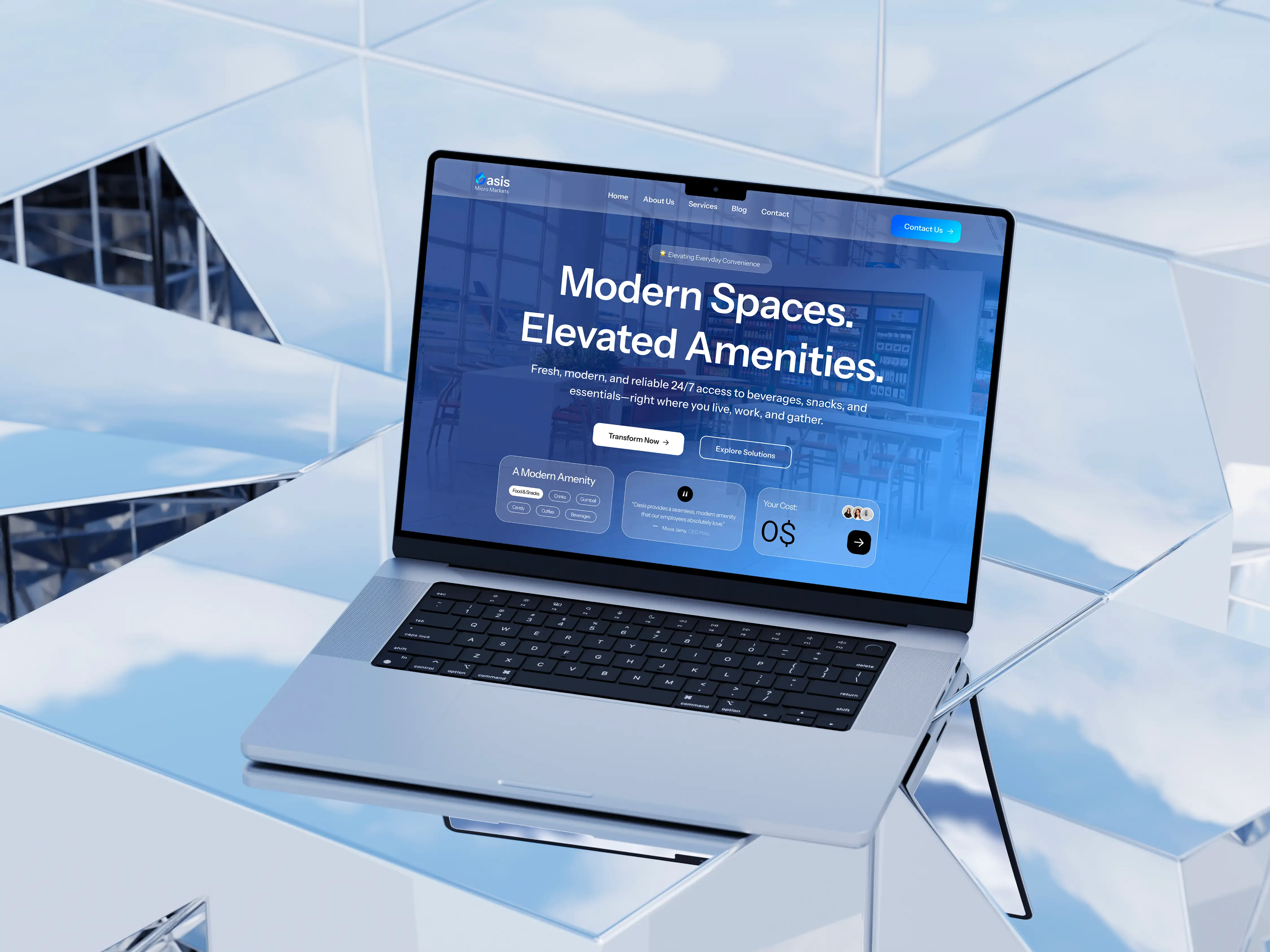
Get this into the design early, because retrofitting roles onto a finished dashboard usually means rebuilding the navigation. In the workplace-experience platform Oasis, different user types needed genuinely different entry points into the same underlying data, and mapping those roles up front saved a lot of rework later. It also helps to be clear about where design ends and implementation begins — the permission logic is engineering's domain, and I cover that handoff boundary in UI designer vs. frontend developer.
Design the empty, loading, and error states first
The most neglected part of B2B dashboard design is every state that is not the demo. Real dashboards spend meaningful time loading, sometimes fail, and a brand-new account starts completely empty. If you only design the full, happy-path screen, users meet a broken-looking product at the exact moments trust is most fragile.
Empty states are onboarding
An empty dashboard is a new user's first impression. Instead of a blank grid, it should explain what will appear here and give one clear action to populate it — connect a data source, invite a teammate, import a file. A good empty state quietly teaches the product.
Loading and error states protect trust
For loading, use skeleton screens that mirror the real layout so the page doesn't jump when data arrives, and load the top-tier KPIs first so the most important answer appears soonest. For errors, be specific and recoverable: say which widget failed, why if you can, and offer a retry — never blank a whole dashboard because one API call timed out. Partial failure should degrade gracefully, card by card.
Performance is a design constraint
Dashboards pull a lot of data, and a beautiful design that takes several seconds to render is a bad design. Performance decisions belong in the design phase, not just engineering's. Paginate or virtualize long tables instead of rendering tens of thousands of rows. Default date ranges to something reasonable rather than "all time." Aggregate on the server where you can. Load progressively — show the headline numbers immediately, let heavier charts fill in. Every one of those is a design choice about what the user sees, and when.
Accessibility is not optional in B2B
People use these tools all day, every day, which makes accessibility both an ethical baseline and a practical one. The essentials: never encode meaning in color alone — pair red/green status with icons, labels, or shape, because a meaningful share of users can't distinguish them reliably. Hold text contrast to WCAG AA. Make the whole dashboard keyboard-navigable, because power users live on the keyboard and will thank you. Give charts text alternatives and let data be reached as an accessible table, not just a canvas a screen reader can't parse. Respect reduced-motion settings for any animated transitions. Accessible dashboards are almost always clearer dashboards for everyone.
Put it together
Strong B2B dashboard design is mostly discipline: rank your KPIs, give each card one job, keep filters honest, design every state, and treat performance and accessibility as part of the craft rather than cleanup. Do that and you get a tool people actually rely on — which, for a B2B product, is the entire goal.
If you are building or reworking a dashboard and want a designer who thinks in KPI hierarchy, real data states, and frontend-ready handoff, tell me about your project. I reply within 24 hours and send a fixed written quote — no hourly surprises, no vague estimates.

Product-minded UI/UX designer & Figma specialist. I design conversion-focused, frontend-ready digital experiences for SaaS teams, startups and brands.