SaaS Onboarding UX: How to Turn Sign-Ups Into Active Users
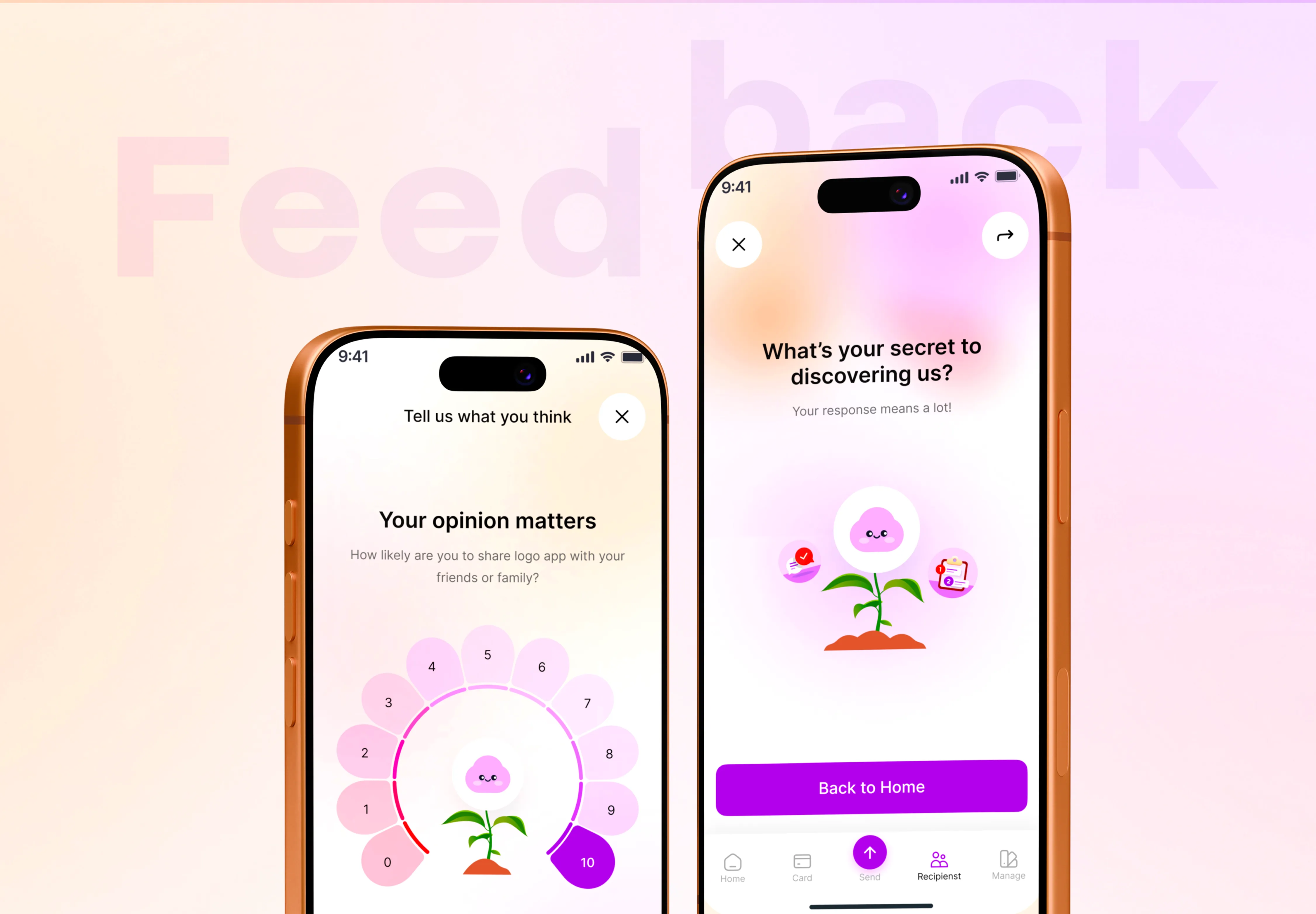
Good SaaS onboarding UX gets a new user to their first real result as fast as possible, then teaches the rest in context as they need it. It is the single biggest lever on activation and retention, because most people who sign up feeling lost never come back to give you a second chance. Onboarding is not a welcome tour or a checklist bolted onto the end of a build. It is the first product experience, and for a lot of users it is the only one they will judge you by.
I have spent years designing product interfaces for startups, and the pattern repeats. Teams pour effort into features and the pricing page, then hand a brand-new user a blank screen and hope they figure it out. They do not. This piece walks through why onboarding decides activation, the first-run principles that actually move the number, the mistakes I see most often, and how to measure whether any of it is working.
Why onboarding decides activation and retention
A sign-up is not a win. It is a person who is curious and slightly skeptical, giving you a few minutes to prove the product does what the landing page promised. Activation is the moment they experience that value for the first time inside the product, not when they create an account. The gap between those two events is where most SaaS products quietly lose the majority of their new users.
Retention compounds from that first session. Someone who reaches a real result on day one has a reason to return. Someone who pokes around a confusing dashboard, hits a wall, and closes the tab has none. You can win them back with email, but it is far more expensive than getting the first run right. This is why saas onboarding ux is a growth problem, not a cosmetic one: the same acquisition spend converts far better when the first experience is designed to deliver a win.
The first-run principles that actually matter
Strong user onboarding design is not about more screens. It is about removing everything between a new user and their first meaningful outcome, then teaching the rest at the moment it becomes relevant.
Optimize for time-to-value
Time-to-value is the clock from sign-up to the first real result the product exists to deliver. For an analytics tool that might be seeing one live chart with their own data. For a scheduling app it is a booked meeting. Name that moment explicitly, then cut every step that does not move the user toward it. Long setup wizards, mandatory profile fields, and feature tours that delay the payoff all push time-to-value in the wrong direction.
Use progressive disclosure
New users cannot absorb your whole feature set at once, and they do not need to. Progressive disclosure means showing only what is required for the next step and revealing depth as people grow into the product. The settings, integrations, and power features can wait until someone has a reason to look for them. Front-loading everything is one of the fastest ways to overwhelm a first-time user into leaving.
Make empty states teach
Empty states are the most underused surface in onboarding. A blank projects list, an empty inbox, a dashboard with no data — these are exactly the moments a user is ready to act. Instead of a lonely "No items yet," an empty state should show what goes here, why it matters, and a single obvious action to fill it. Done well, the empty state teaches the feature at the precise moment it is relevant, with no separate tutorial needed. This ties directly into good SaaS dashboard design principles, where the first-load state carries most of the teaching.
Prefer contextual guidance over tours
Multi-step product tours feel productive to build and rarely help. People click through them to make the modal disappear, retaining almost nothing. Contextual guidance — a tooltip that appears when a user first opens a specific panel, an inline hint next to a field, a nudge triggered by what they just did — teaches at the point of need. The rule of thumb: guide inside the task, not in front of it.
Use checklists to create momentum
A short setup checklist works because it gives new users a clear sense of progress and a reason to take the next small step. Keep it to a handful of items that genuinely lead to value, mark the easy ones as already done to build momentum, and let it collapse once the user is up and running. A checklist with fifteen items is a chore; one with four is a path.
Personalize only where it pays off
A single question at the start — role, team size, what they want to accomplish — lets you tailor the first run to what the user actually came for. Personalization is worth it when it changes what you show next. It is not worth it when it is just a longer form standing between the user and the product. Ask only what will change the experience, and make it skippable.
- Define the one "first result" a new user should reach, and time how long it takes.
- Cut every step that does not move them toward that result.
- Teach in empty states and tooltips, not in a tour that runs before the work.
- Keep any setup checklist to four or five value-driven items.
- Only ask onboarding questions that change what you show next.
Common SaaS onboarding UX mistakes
Most onboarding failures are not exotic. They repeat across products, and they are fixable once you know to look for them.
- Treating sign-up as the finish line. The work starts after the account is created, not before.
- Forcing setup before value. Asking users to connect integrations, invite their team, or configure settings before they have seen a single result kills momentum.
- Feature tours instead of teaching. A carousel of tooltips explaining every button teaches nothing and delays the payoff.
- Dead empty states. A blank screen that says "Nothing here yet" wastes the exact moment the user is ready to learn.
- No obvious next action. When every screen offers ten equal choices, a new user freezes. Each step should have one clear primary action.
- Ignoring the returning-but-inactive user. Onboarding is not only day one. Someone who comes back on day three still needs a clear path forward.
If several of these sound familiar and your activation numbers are soft, the problem is rarely one screen. It is usually the whole first-run flow, which is a common trigger among the signs your SaaS needs a UX redesign. Fixing it well often means rethinking the flow rather than repainting it.
How to measure onboarding, honestly
You cannot improve onboarding you do not measure, and vanity metrics will mislead you. Sign-up counts feel good and tell you little. Focus instead on whether people reach value and stay.
Define activation as a concrete milestone
Pick the specific in-product action that best predicts a user sticking around, and call that activation. Not "logged in" — something real, like "created their first project and invited a teammate" or "connected a data source and saw a report." Make it a milestone you can count, then measure the percentage of new sign-ups who reach it.
Track the drop-off, step by step
Map the first-run flow as a funnel and instrument each step. Where do people stop? A steep drop at one screen tells you exactly where the friction lives. This is far more useful than an overall completion rate, because it points to the fix rather than just confirming a problem.
Watch time-to-value and early retention together
Track how long activated users take to reach their first result, and watch whether shortening it improves day-7 and day-30 return rates. If faster time-to-value moves retention, you know onboarding is doing its job. If it does not, your activation milestone may be pointing at the wrong moment. As a rough guide, meaningful onboarding improvements typically show up over weeks of cohorts, not overnight — treat single-day spikes with caution.
Watch real sessions
Numbers tell you where users drop; watching a handful of real first-run sessions tells you why. A few session recordings or short usability tests with people who match your audience will surface confusion that no funnel chart can explain. This is the same instinct behind getting the core flows right early when you design an MVP — you learn more from watching five people than from guessing.
Onboarding is a design problem, not a feature
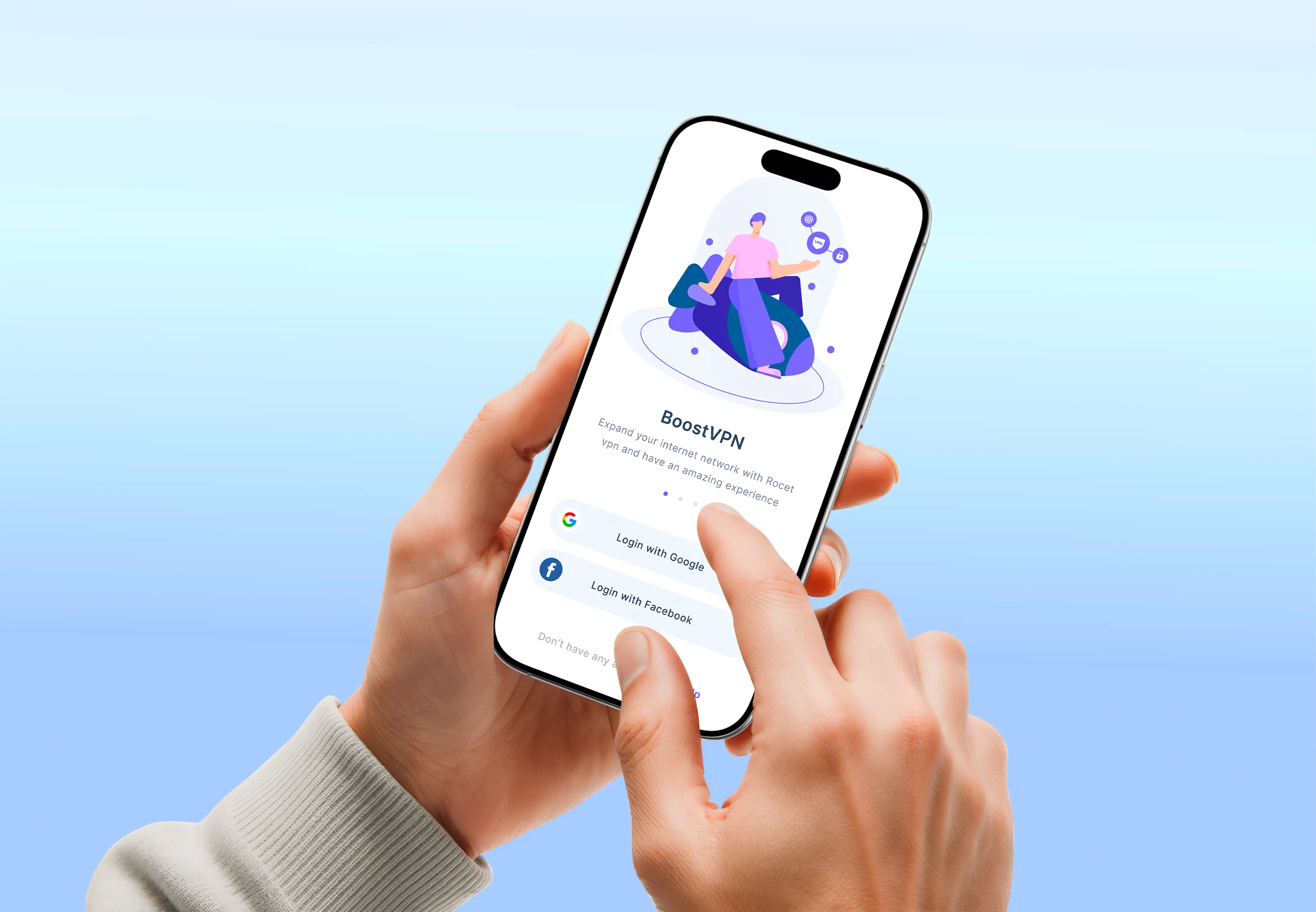
The teams that get user onboarding design right treat the first run as a deliberately designed path, not a byproduct of the features they happened to build. That means deciding the one result a new user should reach, removing everything in the way, and teaching the rest in context. It is detailed work, and it is where a lot of activation is won or lost. When I designed the first-run flow for the BoostVPN mobile app, the priority was the same: get the user to a working, protected connection in as few taps as possible, and explain the rest only once they were in.
If your sign-ups are healthy but activation is soft, onboarding is usually the highest-leverage place to look. If you want a second set of eyes on your first-run flow, tell me about your project. I reply within 24 hours and send a fixed written quote, so you will know the scope and cost before any work starts.

Product-minded UI/UX designer & Figma specialist. I design conversion-focused, frontend-ready digital experiences for SaaS teams, startups and brands.