SaaS Dashboard Design: 12 Principles I Use on Every Data Product
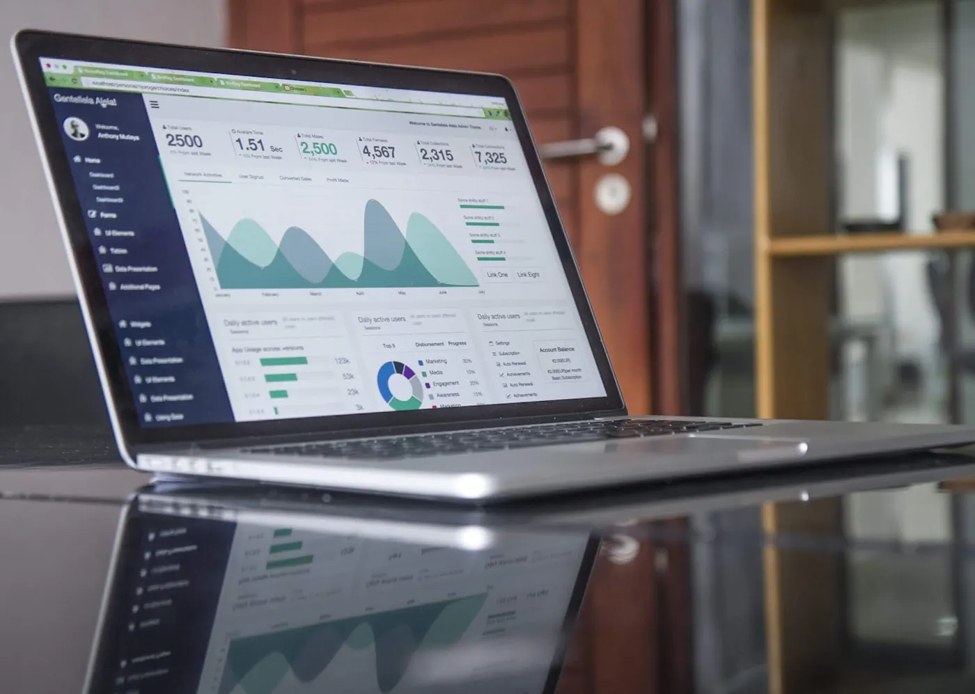
I've designed dashboards for analytics platforms, fintech tools, feedback systems and ecommerce operators — including MetaMetric, an analytics product whose entire value lives on one screen. Across all of them, the same truth repeats: nobody wants a dashboard. People want decisions. The dashboard is just the room where decisions happen — and most of those rooms are hoarder houses.
These are the twelve principles I apply on every data product I design. They're not theory; each one exists because I watched its absence hurt a real product.
1. Write the briefing before you draw
Before any layout, I write the dashboard as a spoken briefing: "Revenue is up, orders are flat, one store needs attention." That sentence order becomes the visual order. If you can't write the briefing, you're not ready to design the screen — you don't know what it's for yet.
2. One question per card
Every card answers exactly one question: How much did we sell? Is it growing? Where is it coming from? When a tile tries to answer two questions, users answer neither — they just see "a chart." Splitting cards costs pixels and saves comprehension. It's always worth it.
3. Headline numbers first, evidence second
Operators scan; analysts dig. Serve both with a strict hierarchy: big KPI numbers with trend deltas on top, trend charts below, breakdowns and tables on demand. The MetaMetric redesign followed exactly this: what happened → what's trending → what needs attention.
4. Pick charts like words
A chart type is a sentence template. Line says "this changed over time." Bar says "these compare." Heatmap says "this pattern repeats." If the sentence you want is "we're mostly on target," the answer might be a single number with a delta — not a chart at all. Chart variety is not a feature; it's usually noise.
5. Density is earned, not default
The classic dashboard failure is launching at maximum density because "power users asked for it." Start calm. Let users expand, pin, and add. A screen that starts dense punishes the 80% to flatter the 5% — and even the 5% mostly wanted their three numbers, not all fifty.
6. Zero states are part of the product
Every chart has a day-one state, an empty-filter state, and a something-broke state. Design all three. "No data yet — connect your store to see revenue" converts; a skeleton loader that never resolves churns.
7. Numbers need context or they're decoration
"$12,480" means nothing. "$12,480 — up 8% vs last month" means something. Every metric gets a comparison: previous period, target, or benchmark. If there's no meaningful comparison, question whether the metric belongs on screen at all.
8. Color is a signal channel — spend it on meaning
On data screens I keep interface chrome nearly monochrome so color can carry meaning: good, bad, warning, selected. When brand colors, chart palettes and status colors all shout at once, users stop hearing any of them. One accent for the interface; a disciplined palette for the data.
9. Respect reading gravity
Top-left is the most valuable real estate in a left-to-right interface. Put the single most decision-driving number there. I've watched sessions where users formed their entire opinion of the day in the first two seconds — from whatever happened to sit top-left. Make that spot count.
10. Tables are interfaces, not dumps
When a table earns its place, design it: sticky headers, right-aligned numbers with tabular figures, row hover, inline sparklines where trend matters, and a clear primary action per row. A well-designed table often beats four mediocre charts.
11. Motion only in service of causality
Animation on data screens has one job: show what changed and why (a filter narrowed the set; a value updated). Decorative motion on a tool people use fifty times a day becomes friction by Thursday.
12. Measure time-to-decision
The success metric for a dashboard is not engagement — it's how fast a user gets from open to informed action. If a redesign makes sessions shorter while retention holds, you probably improved it. Design for the exit.
- Write the spoken briefing first; layout follows its order
- One question per card; headline KPIs before evidence
- Every number carries a comparison; every chart earns its type
- Calm by default, density by choice; zero states designed
- Color reserved for meaning; top-left reserved for the decision
The quiet standard
Great dashboards feel almost boring — in the way a great briefing is boring: no drama, just clarity that respects your time. That's the standard I hold on every data product. If you're building one and the screen still feels like a hoarder house, let's talk — this is my favorite kind of problem. More of my thinking on conversion-focused design is in the ROI of UX design.

Product-minded UI/UX designer & Figma specialist. I design conversion-focused, frontend-ready digital experiences for SaaS teams, startups and brands.