Signs You Need a UX Redesign: 7 Signals to Watch in Your SaaS
The clearest signs you need a UX redesign are churn and support tickets clustering on the same flows, new users dropping off during onboarding, and people asking "where is X" for features that already exist. When friction shows up as a repeated pattern in your data rather than a one-off complaint, the interface is the problem, and it is time to act.
Every SaaS founder eventually asks the same question: does my product actually need a redesign, or am I just tired of looking at it? It is a fair thing to be nervous about. A redesign costs money, engineering time, and risk. Do it for the wrong reason and you burn all three. So this piece is about the honest signals, the ones backed by behavior and support data rather than by taste, and about knowing when a redesign is overkill and a few targeted fixes will do.
I am a product designer who also codes, so I look at this the way an engineer looks at a flaky test: what is the actual failure, how often does it fire, and what is the smallest change that fixes it. Here are the seven signs you need a UX redesign, what each one looks like in the wild, and what to do about it.
The 7 signs you need a UX redesign
1. Churn and support tickets cluster on the same flows
This is the loudest signal. Open your support tickets from the last 60 days and tag each one by the screen or flow it mentions. If a third of them point at the same three places, the billing page, the invite flow, the export button, that is not a coincidence. That is the interface failing repeatedly in the same spot.
What to do: Map tickets to screens before you touch a single pixel. Churn tied to a specific flow is usually fixable without a full rebuild. Churn spread evenly across the whole product is the deeper signal that points toward a real redesign.
2. New users drop off during onboarding
Look at your activation funnel. If people sign up and never reach the "aha" moment, the first real action that shows them the value, your onboarding is leaking. A steep drop between account creation and first meaningful use is one of the most reliable signs you need a UX redesign, at least of that flow.
What to do: Watch five to ten session recordings of new users. You will usually see the exact step where people stall, an empty state with no next action, a form that asks for too much too soon, a setup that assumes knowledge they do not have yet. Fix the path to first value first; it is often the highest-return work in the whole product.
3. Feature bloat has buried the core job
Successful products accumulate features. Each one made sense on its own, but stacked together they crowd the interface until the thing users came to do is three clicks deep behind things most of them never use. When your navigation has grown to fifteen items and new users cannot find the main action, that is feature bloat.
What to do: This one rarely needs a ground-up redesign. It needs editing. Pull usage data, find the 20 percent of features that drive 80 percent of the value, and rebuild the hierarchy around them. Demote or hide the rest. Good SaaS dashboard design principles are mostly about restraint, showing the right thing at the right moment instead of everything at once.
4. The UI got inconsistent as the team grew
Three designers, five engineers, two years, and no shared system. Now you have four button styles, three shades of the same blue, modals that behave differently on every screen, and spacing that changes page to page. Each piece works, but the product feels stitched together, and that erodes trust in a way users feel even if they cannot name it.
What to do: This is a design system problem, not necessarily a redesign. Audit your components, consolidate to one source of truth, and standardize the patterns. The visual result can look like a redesign, but the underlying structure and flows stay the same, which makes it far cheaper and lower risk.
5. Users keep asking "where is X"
When the same question comes up in support, in sales calls, and in your own onboarding sessions, "how do I find settings," "where do I export," "can it even do this," the feature usually exists. People just cannot find it. That is a navigation and information architecture failure, and it quietly caps how much value people get from what you already built.
What to do: Run a quick tree test or card sort to see how users expect your product to be organized, then restructure the navigation to match their mental model instead of your internal org chart. This is often a targeted fix with an outsized payoff, because you are unlocking value you already shipped.
- Tickets cluster on the same flows → fix those flows, watch for spread
- Drop-off before first value → rework onboarding path
- Fifteen nav items, core action buried → edit and re-prioritize, not rebuild
- Four button styles, three blues → design system, not redesign
- "Where is X" on features that exist → fix information architecture
- Friction everywhere plus a model that no longer fits → full redesign is justified
6. It works, but it feels dated
This one is the trickiest, because "dated" is subjective and easy to overreact to. Sometimes an old-looking product converts fine and the itch to redesign is pure founder fatigue. But sometimes dated is doing real damage: prospects bounce off the demo because it looks like a tool from a decade ago, or your pricing sits above competitors whose interfaces feel more current. Perception of quality is part of the product.
What to do: Be honest about whether "dated" is costing you deals or just annoying you. If it is showing up in lost demos and sales objections, a visual refresh is worth it. If it is not, spend the budget on the flows that actually move retention. A redesign that only changes the paint rarely changes the metrics.
7. Metrics stay flat no matter how many features you ship
You keep shipping. Activation, retention, and expansion do not move. This is the sign most founders read wrong, because the instinct is to ship even more. But flat metrics against a rising feature count usually mean the problem is not missing features, it is that the experience around the existing ones is not converting attention into habit. More features on a shaky foundation just add more places to get lost.
What to do: Stop and instrument the core journey before building anything new. If the fundamentals are sound and only a few flows are broken, targeted fixes win. If the whole model no longer fits how people actually work, that is when a full redesign earns its cost. It helps to be clear-eyed about the payoff first; the ROI of UX design comes from removing friction on the paths people actually take, not from a prettier coat of paint.
Full redesign vs targeted fixes: how to tell
Here is the honest part most agencies will not tell you: a full redesign is usually not the answer. It is the expensive answer, and it should be your last option, not your first. Reach for it only when the evidence points to something structural.
Targeted fixes are the right call when the friction is concentrated. Tickets point at a handful of flows, onboarding leaks at one identifiable step, the visual mess is really an inconsistency problem, or people cannot find features that already work. In all of these, you are repairing specific parts while the core model holds. Faster, cheaper, far less risky, and you can measure the result flow by flow.
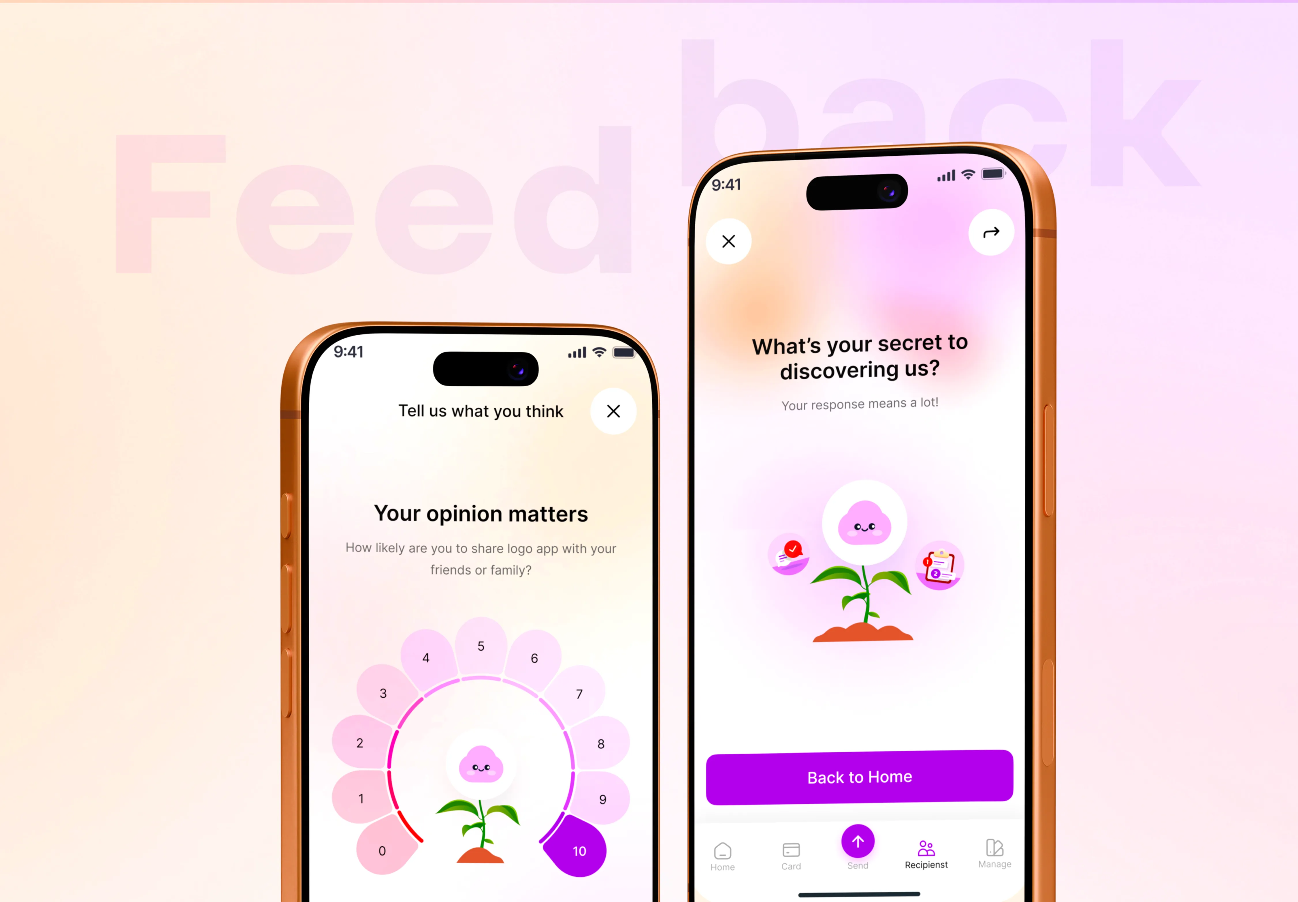
A full redesign is justified when the friction is everywhere and the underlying structure no longer fits. The mental model behind the product has drifted from how users actually think. The information architecture cannot absorb where the product needs to go. Every new feature fights the existing layout. At that point, patching individual screens just moves the pain around, and rebuilding the foundation is genuinely cheaper than maintaining the old one. When I redesigned FeedFlow, a feedback app, the goal was exactly this kind of structural clarity, an interface built around the one job users came to do rather than the pile of things it had accumulated.
The way to know which camp you are in is not a gut feeling. It is a short UX audit: map tickets to screens, watch real sessions, check the activation funnel, and inventory your components. An afternoon of that will tell you whether you are looking at three fixable flows or a foundation problem, and it will save you from spending redesign money to solve a design-system problem.
The bottom line
The real signs you need a UX redesign are patterns, not opinions. Clustered tickets, onboarding drop-off, buried core actions, "where is X," flat metrics against a growing feature set. When two or three of these show up together and the underlying model no longer fits, a redesign pays for itself. When only one flow is broken, fix that flow and keep your budget. Either way, start with evidence, not with a redesign you already decided you wanted.
If you are not sure which side of that line your product is on, that is exactly the kind of thing I help founders figure out before anyone commits to a build. Tell me about your project and I will look at where the friction actually lives. You get a reply within 24 hours and a fixed written quote, so you know the scope and the cost before you decide whether a targeted fix or a full redesign is the right move.

Product-minded UI/UX designer & Figma specialist. I design conversion-focused, frontend-ready digital experiences for SaaS teams, startups and brands.