MVP Design: How to Build an MVP That Doesn't Look Cheap
Good MVP design means cutting scope, not craft: you ship fewer features, but the ones you keep look and feel finished. "Minimum" refers to how much your product does, never to how cheap it looks. The MVPs that raise the next round and win early users are the ones where a founder was ruthless about scope and disciplined about the few screens that survived.
What "minimum" actually means in MVP design
The word "minimum" gets misread constantly. Founders hear it as "rough," "temporary," or "we'll make it nice later," and they ship something that quietly tells every visitor the product isn't real yet. But the users testing your MVP don't grade on a curve. They compare it to every other app on their phone, and a broken-looking interface reads as a broken product — even when the code underneath is solid.
Proper MVP design separates two decisions that usually get tangled together. The first is what the product does — and here you should be aggressive, cutting until it hurts. The second is how well the surviving parts are executed — and here you should refuse to compromise. A to-do app with one screen that feels considered beats a project-management suite with twelve screens that all feel like a wireframe. Minimum scope, maximum polish on that scope. That is the whole discipline.
What to cut vs. what to keep
Most feature lists for a first version are twice as long as they should be. The way to shorten them is to ask a single question of every feature: does the core promise of the product break without it? If the answer is no, it waits.
Cut early: settings pages, profile customization, multiple onboarding paths, admin dashboards, notification preferences, dark mode, integrations you can fake manually, and anything a user reaches only after they're already convinced. These feel important because mature products have them — but mature products earned them after proving the core first.
Keep, and design properly: the one action your product exists to make easy, the path a first-time user takes to reach it, and the moment they realize it worked. That last one — the payoff — is the single most under-designed part of most MVPs, and it's the part that decides whether someone comes back.
A useful reframing: you're not building a smaller version of the finished product. You're building the smallest thing that can prove the core idea is worth finishing. Those are different objects, and the second one is far cheaper to make well.
Design the core loop first
Every product has a core loop — the small cycle of actions a user repeats to get value. Open, do the thing, see the result, come back. In MVP design, that loop is the entire product. Everything else is scaffolding around it, and scaffolding can be crude as long as the loop is not.
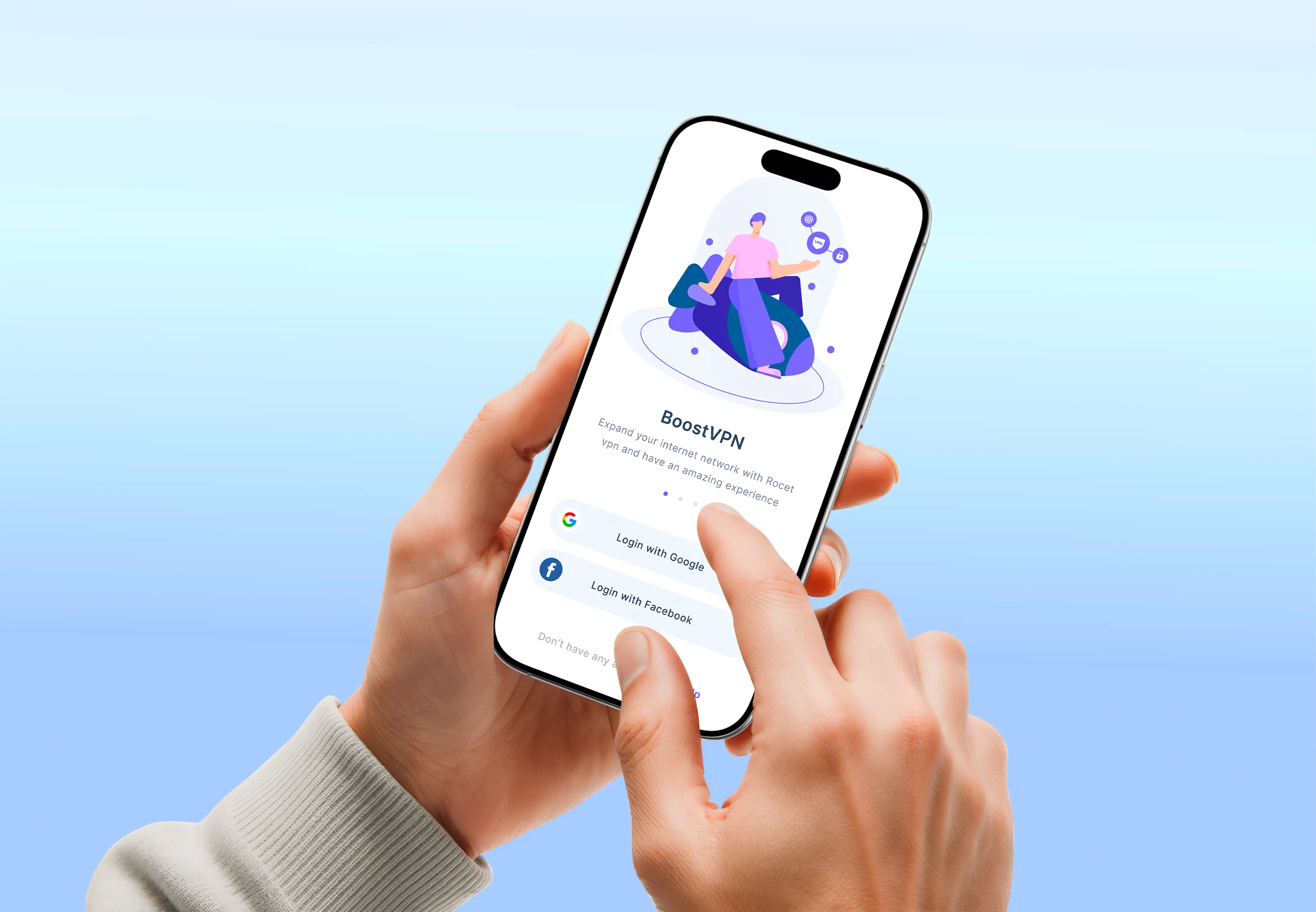
When I designed the BoostVPN mobile app, the usage reality was blunt: people open the app to press one button and close it. So the design collapsed around that single moment. One oversized connect button with unmistakable connected, connecting, and protected states. Server selection moved into a fast sheet, out of the way but one tap deep. Onboarding rebuilt to reach the first successful connection in seconds. Everything a VPN could show — protocols, maps, speed graphs — was deliberately kept off the screen the user actually lives on.
That is core-loop thinking applied to an MVP. Find the ten-second moment your product is really about, make that moment feel instant and certain, and let the rest be plain. Founders who instead spread their design effort evenly across every screen end up with a product that is uniformly mediocre — which is worse than one great loop surrounded by honest simplicity.
A light design system from day one
The fastest way to make an MVP look cheap is inconsistency: three shades of blue, buttons at four different heights, spacing that was eyeballed screen by screen. It reads as carelessness, and carelessness reads as risk. The fix is a light design system, and it's a day-one decision, not a cleanup you schedule for later.
"Light" is the operative word. You don't need a hundred-component library for an MVP — that's its own form of over-building. You need a small set of decisions made once and reused everywhere: a type scale with two sizes for headings and one for body, a spacing system built on a 4px or 8px baseline, one primary color that means "act here" and one neutral ramp for everything else, and a single button component with its states defined. Ten decisions, applied consistently, are what make a five-screen product feel like it was made by people who know what they're doing.
This is also where cutting corners quietly costs you more later. A handful of reused tokens and components is what lets version two get built without redrawing everything — the same discipline I lean on when building design systems developers actually use. Set it up light at the start and it grows with you. Skip it and every new screen is a fresh argument about what blue you're using.
- Scope is minimum, quality is not. Cut features hard; finish the ones that survive.
- Design the core loop first. Find the ten-second moment your product is really about and make it feel certain.
- Light design system on day one. One type scale, one spacing unit, one accent color, one button — reused everywhere.
- States are not optional. Empty, loading, and error states are where "MVP" turns into "cheap."
- Build for version two. Structure the file so the next iteration extends it instead of replacing it.
States and empty states are where MVPs look cheap
Here's the detail that separates a considered MVP from a demo: the states. Real products spend most of their time in conditions the happy-path mockup never shows. A new user's dashboard is empty. The network is slow and something is loading. A form was filled in wrong. A search returned nothing. When those moments are undesigned, the whole product suddenly looks unfinished — because it is.
Empty states are the highest-leverage fix. A blank screen the first time someone signs in tells them nothing and quietly invites them to leave. An empty state that shows what will appear here and points to the one action that fills it does onboarding for free — often better than a tour. Loading states that reserve space stop the layout from jumping. Error messages that say what went wrong and how to fix it, right next to the field, turn a dead end into a recoverable moment. None of this is expensive. It's just work that inexperienced MVP design skips, and experienced MVP design never does. It matters even more on data-heavy products, where the same discipline drives good SaaS dashboard design — an empty dashboard is a design problem, not an afterthought.
How to avoid rework
The expensive mistake in MVP design isn't shipping too little — it's shipping in a way that forces you to throw it all out for version two. Rework is the tax founders pay for treating the MVP as disposable. A few habits keep that tax low without slowing you down.
- Use real content, not lorem ipsum. Layouts that look great with placeholder text break the moment a real name is twice as long or a real number has seven digits. Design against the truth.
- Name things for the build. When the design file uses the same component names and structure the frontend will use, developers implement it instead of reinterpreting it — and the next iteration extends what exists.
- Design the system, not just the screens. Screens are outputs; the tokens and components behind them are the asset. Get the asset right and new screens are cheap.
- Don't design features you're unsure about. Polishing a screen for a feature that gets cut after the first user test is pure waste. Prototype the uncertain parts roughly; finish only what's committed.
Done this way, your MVP isn't a throwaway. It's the first honest version of the product, built so version two is an addition rather than a demolition.
When to bring in a designer vs. use a template
Not every MVP needs a designer, and I'll say that plainly. If you're validating a simple idea and a well-chosen template gets you to a testable product this week, use the template — spending a month on custom UI to test an unvalidated hypothesis is its own kind of over-building. Templates are a legitimate tool for the earliest, cheapest experiments.
Bring in a designer when the interface is the product — when the core loop is something users do repeatedly and the quality of that experience is what you're actually testing. A dashboard, a mobile app, a tool with real states and real data: these live or die on how the interaction feels, and a template can't make those decisions for you. That's the work I do with early-stage teams as a UI/UX designer for US startups — deciding what to cut, designing the loop that survives, and handing engineers files they can build from directly. Because I'm a designer who codes, that handoff is shaped for the frontend from the start, which is exactly what keeps an MVP from becoming rework.
The honest test: if your differentiator is the idea, a template may be enough to prove it. If your differentiator is the experience, design it.
If you're planning an MVP and want to get the scope and the craft right the first time, tell me what you're building. I reply within 24 hours with real thoughts, and every project starts with a fixed written quote — so you know the scope and the price before any work begins.

Product-minded UI/UX designer & Figma specialist. I design conversion-focused, frontend-ready digital experiences for SaaS teams, startups and brands.