Anatomy of a High Converting Landing Page: Section by Section
A high converting landing page is built from a fixed sequence of sections — hero and value prop, social proof, problem/solution, features framed as outcomes, objection handling, and a single clear call to action — arranged so a visitor can say yes without scrolling back up to re-read anything. The order matters as much as the content, because a landing page is really one argument delivered top to bottom, and every section either moves the reader one step closer to acting or gives them a reason to leave.
I have designed a lot of these pages, and the ones that convert are rarely the prettiest. They are the clearest. Below is the section-by-section anatomy I use when I build a page, why each block earns its place, and the conversion killers that quietly sink pages that look fine in a screenshot.
The one-goal rule comes first
Before any layout, decide the single action this page exists to produce. Book a demo. Start a trial. Send an inquiry. Download the thing. One page, one goal. This is the rule that most quietly separates a high converting landing page from a busy homepage pretending to be one.
The moment a page asks for two things — "book a call" and "read our blog" and "follow us" — you split the reader's attention and dilute every path. A landing page is not a menu. It is a single argument that ends in a single door. When you honor the one-goal rule, the rest of the landing page structure almost designs itself, because every section can be tested against one question: does this help the reader take the one action, or not?
Section-by-section anatomy of a high converting landing page
1. Hero and value proposition
The hero has one job: in about five seconds, tell the reader what this is, who it is for, and why it is worth their attention. That means a headline that states the outcome in plain language, a subhead that adds the specifics, and one primary call-to-action button. No clever wordplay that hides the offer. If a stranger cannot tell what you do from the headline alone, the hero has failed regardless of how good the visuals are.
The value proposition is not a slogan. It is the answer to "why you instead of the alternative, including doing nothing." Put it above the fold, in the largest type on the page, and resist the urge to bury it under a full-screen animation the reader has to scroll past.
2. Social proof, early
Trust has to arrive before the ask, not after it. Right below the hero is where a strip of client logos, a short real testimonial, a rating, or a simple usage number belongs. It answers the reflexive "who else trusts this?" that every visitor asks silently.
One honest rule here: use real proof only. A vague "trusted by thousands" with no names reads as filler and can lower trust rather than raise it. One specific, attributable quote beats five anonymous ones. If you do not have proof yet, use a concrete guarantee or a clear process instead — never invent it.
3. Problem, then solution
Before you sell the fix, name the pain in the reader's own words. A short problem section — the frustration, the cost of the status quo, the thing they have been putting up with — makes the reader feel understood, and a reader who feels understood keeps scrolling. Then present your offer as the resolution to that exact problem. This ordering is what turns a feature list into a story the reader is already inside of.
4. Features framed as outcomes
This is where most pages leak conversions. They list what the product has instead of what the reader gets. "Real-time sync" is a feature. "Your team stops arguing about which file is current" is the outcome. Lead every feature with the result, then name the feature as the mechanism. The reader buys the outcome; the feature is just the proof the outcome is real.
- Hero: outcome headline, specific subhead, one CTA, visible in five seconds.
- Social proof: real and attributable, placed before the ask.
- Problem/solution: pain named first, in the reader's words.
- Features: outcome first, feature second — never a bare spec list.
- Objections: the top three "yes, but…" answered on the page.
- CTA: one action, repeated, same wording throughout.
- Pricing: clear enough that no one has to email to learn the cost.
5. Objection handling
Every reader has two or three reasons not to act — too expensive, too complex, too risky, "will this even work for my situation." A high converting landing page answers those on the page instead of hoping the reader forgets them. This is what an FAQ, a short comparison, a guarantee, or a "how it works in three steps" section is really for. You are not adding content; you are removing the last hesitations between the reader and the button.
6. Pricing clarity
If money is part of the decision, be clear about it. Hidden pricing forces the reader to do work — email, wait, guess — and every unit of work you add before the ask costs you conversions. Even when you sell custom or project-based work, you can give an honest range or a starting point so the reader can self-qualify. On my own inquiries I quote a fixed written number rather than a vague "it depends," for exactly this reason: clarity converts, and it filters out mismatched leads before either of us wastes time. If you want the fuller picture on what these builds actually run, I break it down in how much a landing page design costs.
7. A single, repeated call to action
End with the one action, worded exactly the same way it was worded in the hero. Repeat that CTA at natural decision points down the page — after the proof, after objections, at the very bottom — but keep it the same action and the same words. A reader who is ready at section four should not have to scroll to find the button, and a reader who is ready at the end should not meet a suddenly different offer.
Hierarchy is what makes the anatomy work
Having the right sections is not enough. Visual hierarchy is what tells the eye where to go and in what order. On a strong page, you can squint until the text blurs and still follow the path: big headline, one bright button, section, section, button. If everything is bold, nothing is. If three elements compete to be the loudest, the reader freezes.
Practical hierarchy rules I hold to: one dominant headline per screen, one primary button color that appears nowhere else, generous spacing so each section reads as its own idea, and a clear size ladder from headline to subhead to body. The landing page structure gives you the skeleton; hierarchy is the muscle that moves the reader through it.
Performance is a conversion feature, not a technical footnote
The best-structured page in the world converts nobody if it loads in six seconds. Speed and stability are part of the anatomy, not a separate engineering concern. A reader who bounces before your hero paints never sees the value proposition you agonized over. I have written about this at length in why performance-driven website design converts better, and the short version holds: a fast, stable page removes friction the reader never consciously notices but always feels.
The essentials: compress and correctly size your hero image, avoid layout shift as things load, keep third-party scripts to what you truly need, and make sure the primary CTA is usable the instant the page is interactive. These are not nice-to-haves. They are the difference between a page that has a chance to convert and one that never gets read.
Common conversion killers
Most underperforming pages share the same handful of self-inflicted wounds. Watch for these:
- More than one goal. Competing CTAs split attention and lower every path's conversion.
- A vague hero. If the headline could belong to ten other companies, it belongs to none.
- Features without outcomes. A spec list makes the reader do the translation work you should have done.
- Proof that is not believable. Anonymous or inflated claims lower trust instead of building it.
- Hidden pricing with no way to self-qualify. Every "contact us to learn more" is a filter you did not mean to add.
- Slow load and layout shift. The reader leaves before the argument starts.
- A wall of text with no hierarchy. If the eye cannot find the path, the reader invents their own — usually toward the back button.
None of these are exotic. They are the default state a page drifts into when no one is deliberately protecting the one goal. Fixing them is mostly a matter of subtraction.
Put the anatomy to work
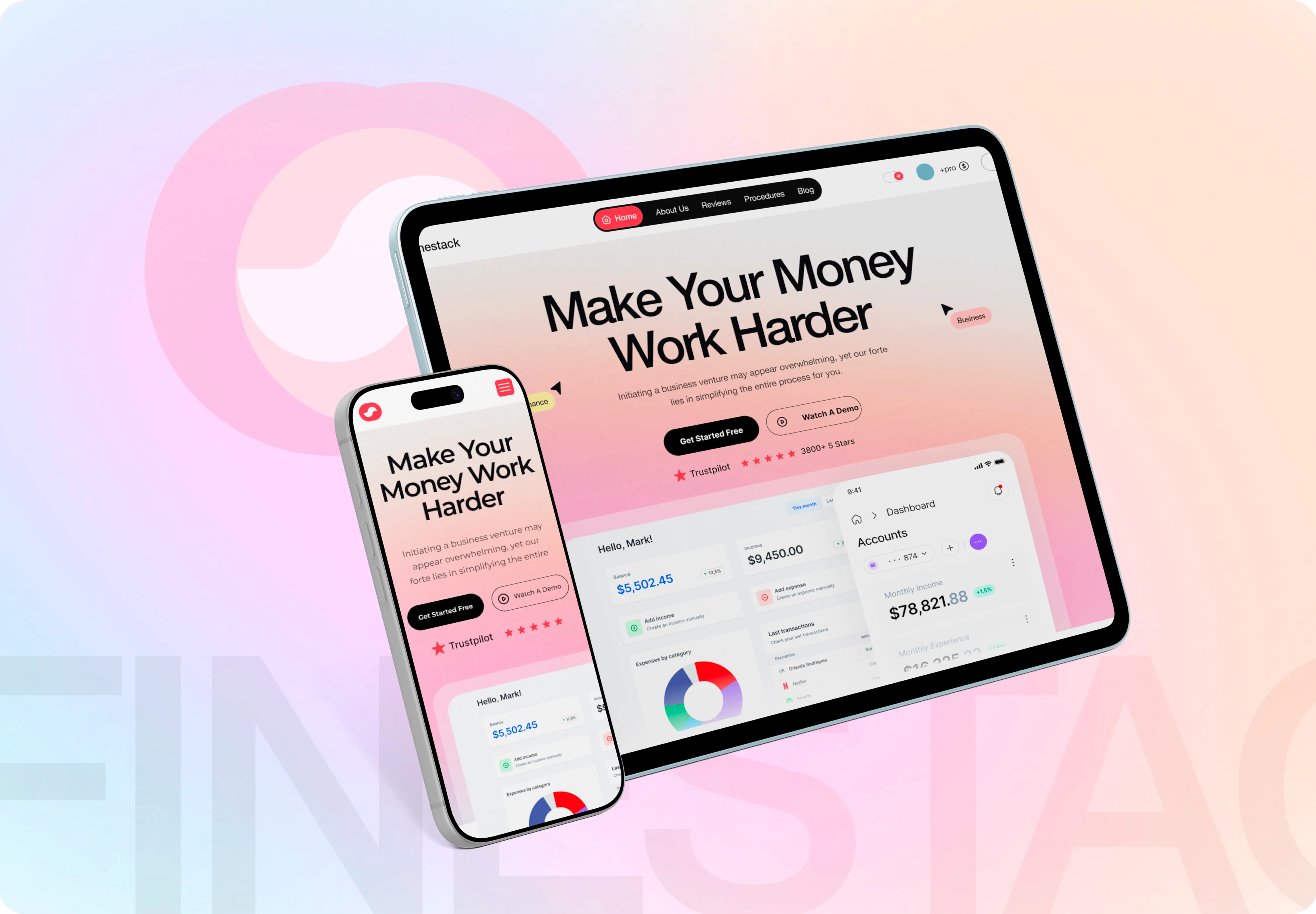
If you want to see this structure applied end to end, the Finestack finance software landing page walks through hero, proof, outcome-led features, and a single CTA in a real build. And before you ship anything, run it against my free website launch checklist so a small miss — a broken button, an oversized hero image — does not quietly cost you the conversions the rest of the page earned.
If you would rather have a second set of eyes on your page, or you want a high converting landing page built from this anatomy rather than a template, tell me about your project. I reply within 24 hours with a fixed written quote — no vague "it depends," so you can decide with the same clarity I am asking you to give your own readers.

Product-minded UI/UX designer & Figma specialist. I design conversion-focused, frontend-ready digital experiences for SaaS teams, startups and brands.